Brand and visual identity project - Skilly
The client
Skilly is a new skill-building and learning platform for a number of industries to better engage and train their employees. This entrepreneurial startup was looking for a fresh and current design that would appeal to the target users and also the buyers, as a platform to help people perform their jobs better every day.
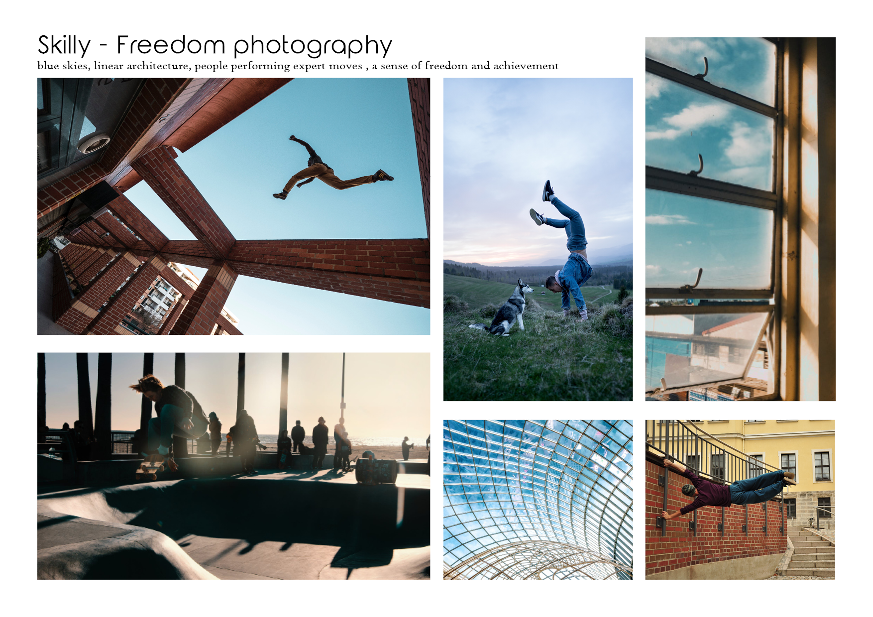
Our team of 3 designers held a brand strategy session using CORE principles and defined our users, stakeholders and key messages. We developed visual concepts to speak to this and I developed the 'Freedom to learn' concept illustrated below as part of the first round pitch.
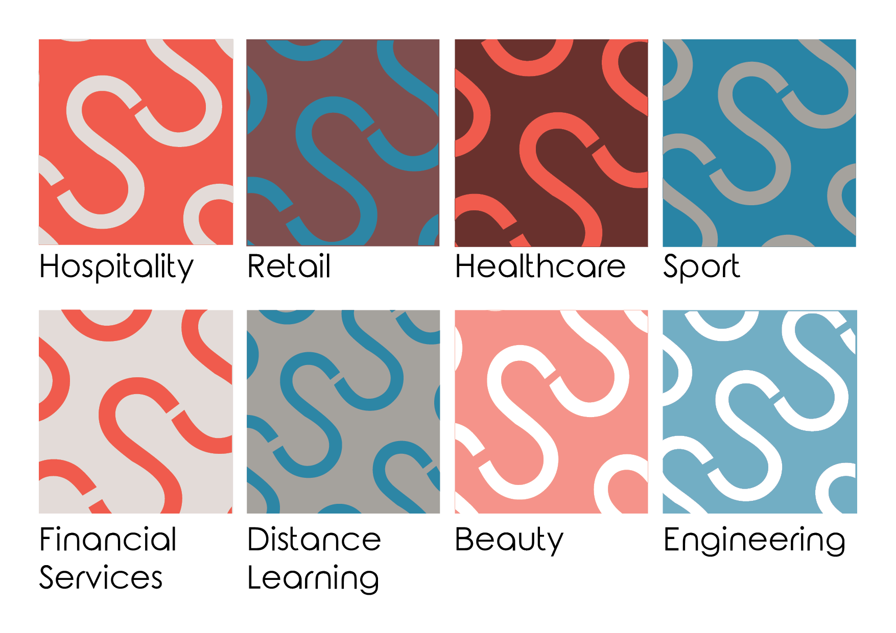
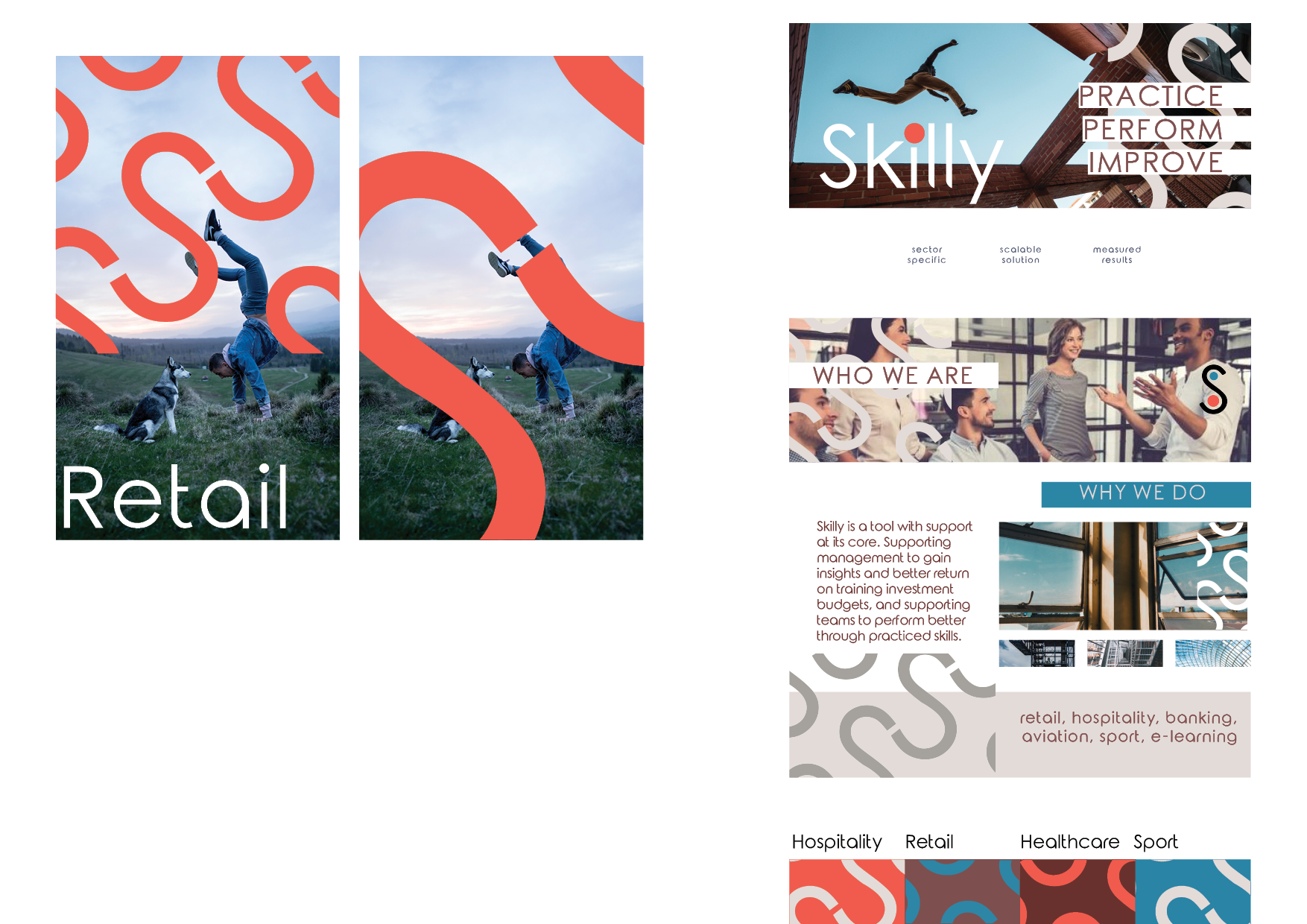
One key element of the client request was a flexible system that could scale up as new sectors became available on the platform. I proposed a pattern system based on the logo, which would expand out on the brand colours and be used as a bold overlay on photograph or a colour accent on materials. I wanted the wordmark and logo to have a visual connection which I did with the dot from the I, aiming to balance coprorate and accessible to appeal to both the user market of employees in retail and hospitality, and the buyer being talent/HR buyers.
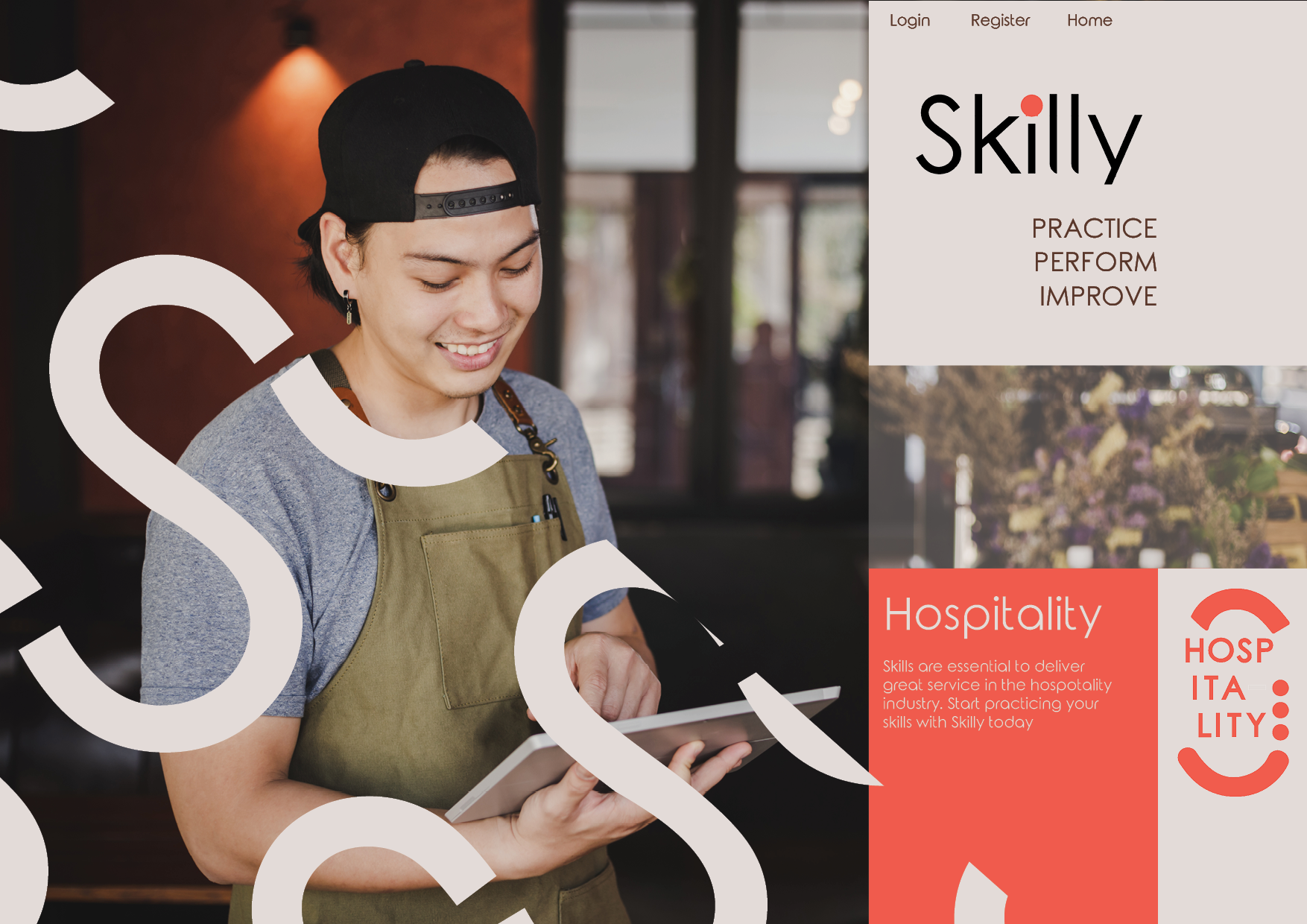
Our client was not a visual person, and mockups were a key element in demonstrating how the branding might work in practice, so these were a large part of the pitch.

