

Nails By Jen - brand identity
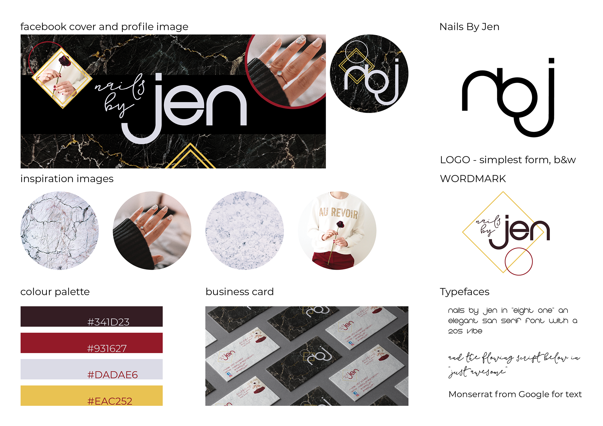
Final designs selected
I completed a brand identity for start-up mobile nail technician, who loved marble and wanted it as part of her brand, to give it a prestige, and make her social pages standout in the marketplace. Facebook was her main platform, with business cards to hand to clients to stay in touch.
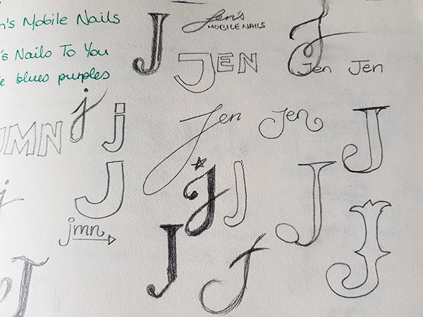
I created options after research and sketching, focusing particularly on wordmark and monogram based logo as the client's first name is key to her brand.
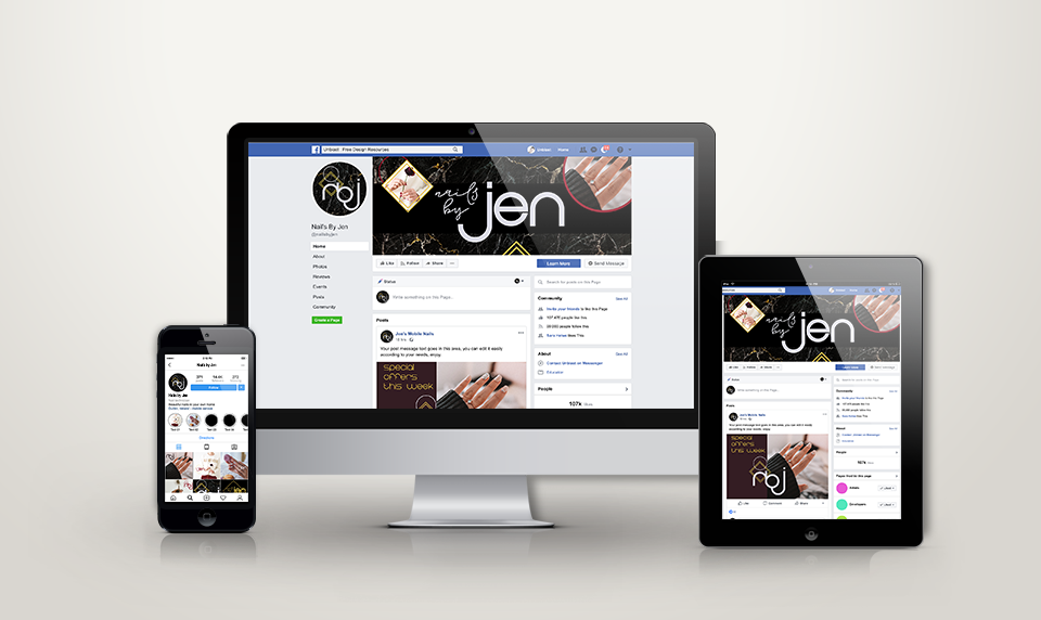
I also included mockups of the brand in the real world, such as social media posts, to show how the system had flexibility and longevity.
Research and development phase
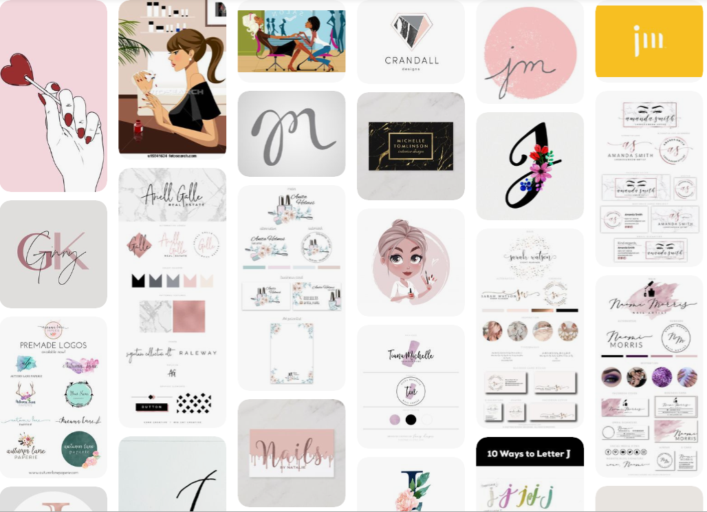
Initial concept presentations
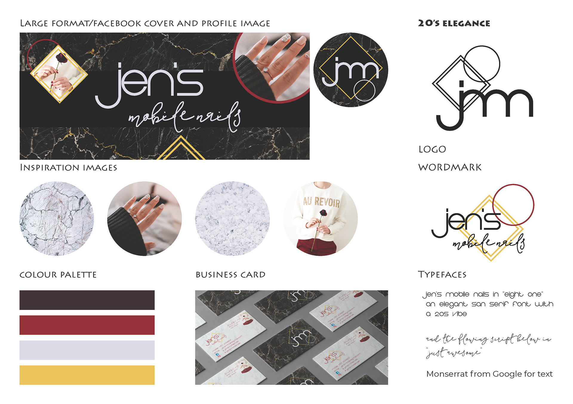
Although the client showed me white marble with purple and pink accents as a first reference, I really heard her desire to appear prestigious and standout in the space. I took a calculated risk and presented visuals that switched to a black, crimson and gold palette, with a 20s art deco vibe. I customized the font used to make a bespoke logotype.
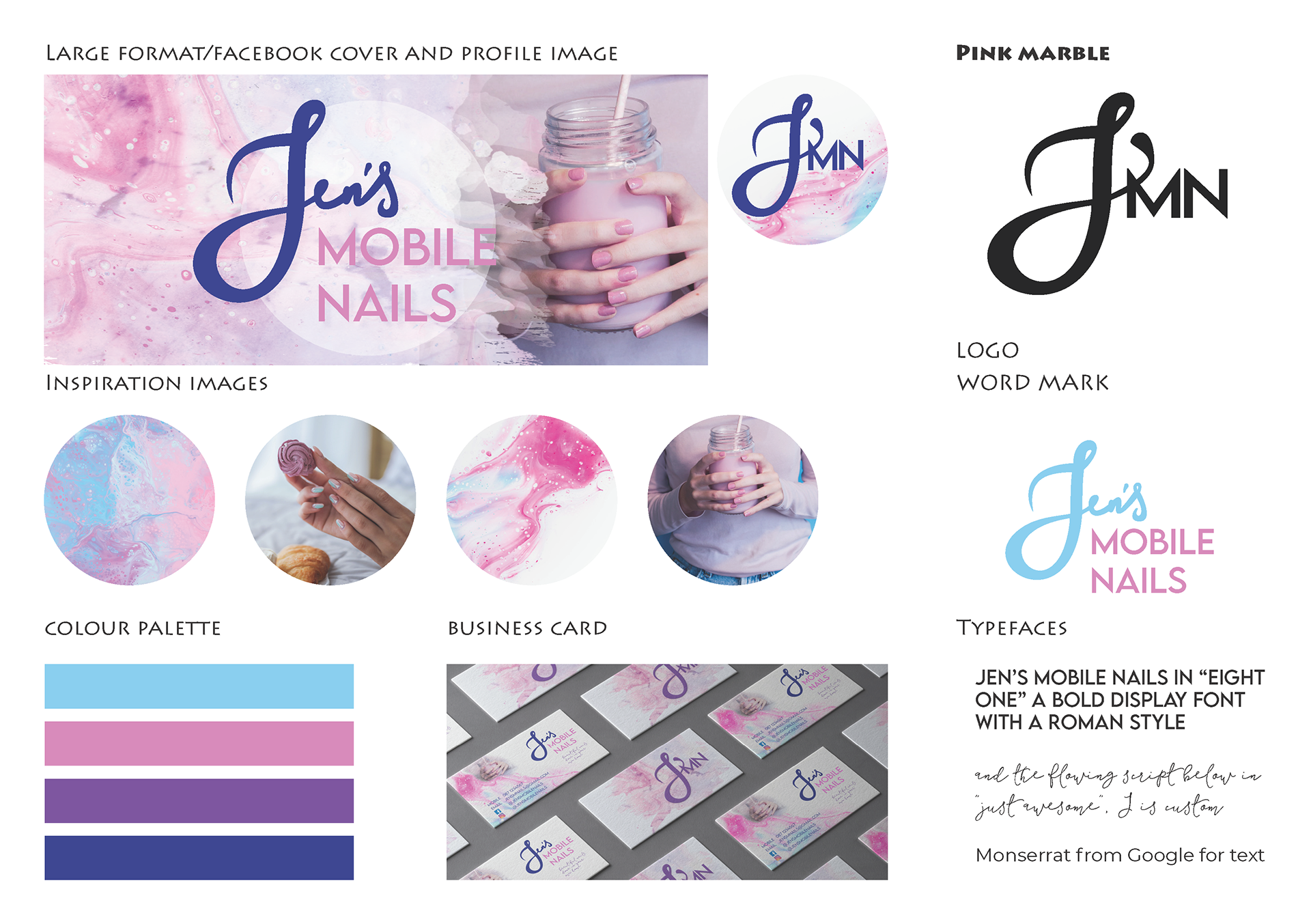
A second concept flowed from a hand-drawnJ to mimic the client's signature and feel personal and accessible, supported with pastel/confectionery colours, common in the market segment.
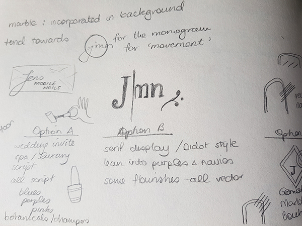
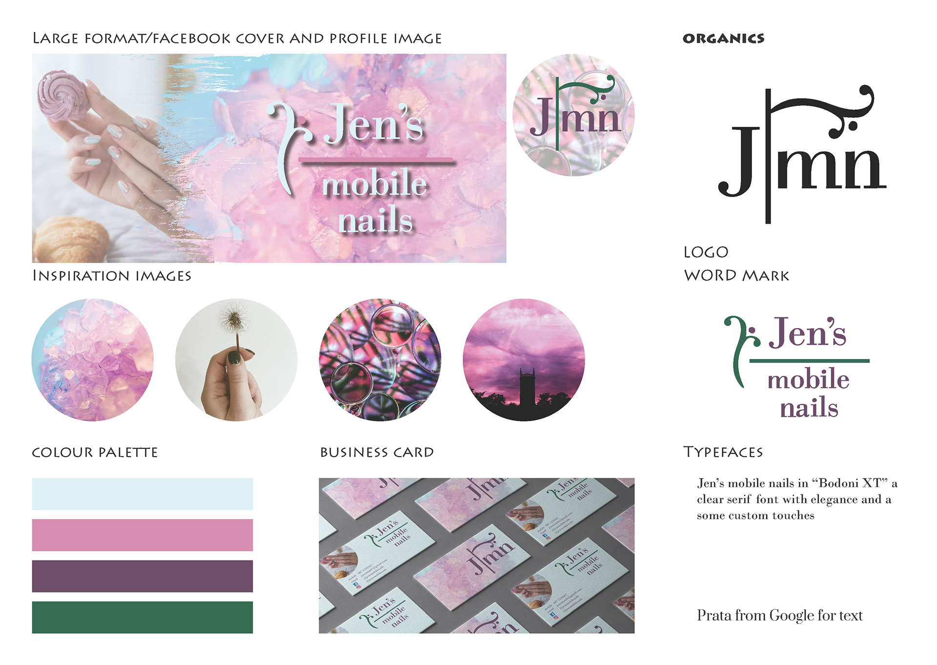
A third concept, continued to play with the pastel theme, but moved towards a more organic motif with a contrasting serif typeface, aligning more to a spa or beautician. The organic motif in the logo was achieved using repetition of the lower arc of the J letterform and its beautiful terminal.
Following our initial kick-off meeting, the brand name changed but the client was delighted with the black marble option, so I re-worked that, in particular the logo type and word mark to match the new name.
All photography was sourced from Unsplash to suit the project budget.